Before we begin, I would like to make it clear I have been guilty of all of the following mistakes, so please don’t feel bad! During the ’90s it was the wild west of web design, featuring far too many annoying pop-ups, no one had ever heard of user experience and Tamagotchi was the hottest tech on the market. Since then, through trial and error, we have discovered rules, principles and facts based on data that can improve usability for users leading to better conversions.
Check your website against these 5 UI / UX mistakes to see if you could make improvements that could lead to better conversion rates.
01. Who & Why?
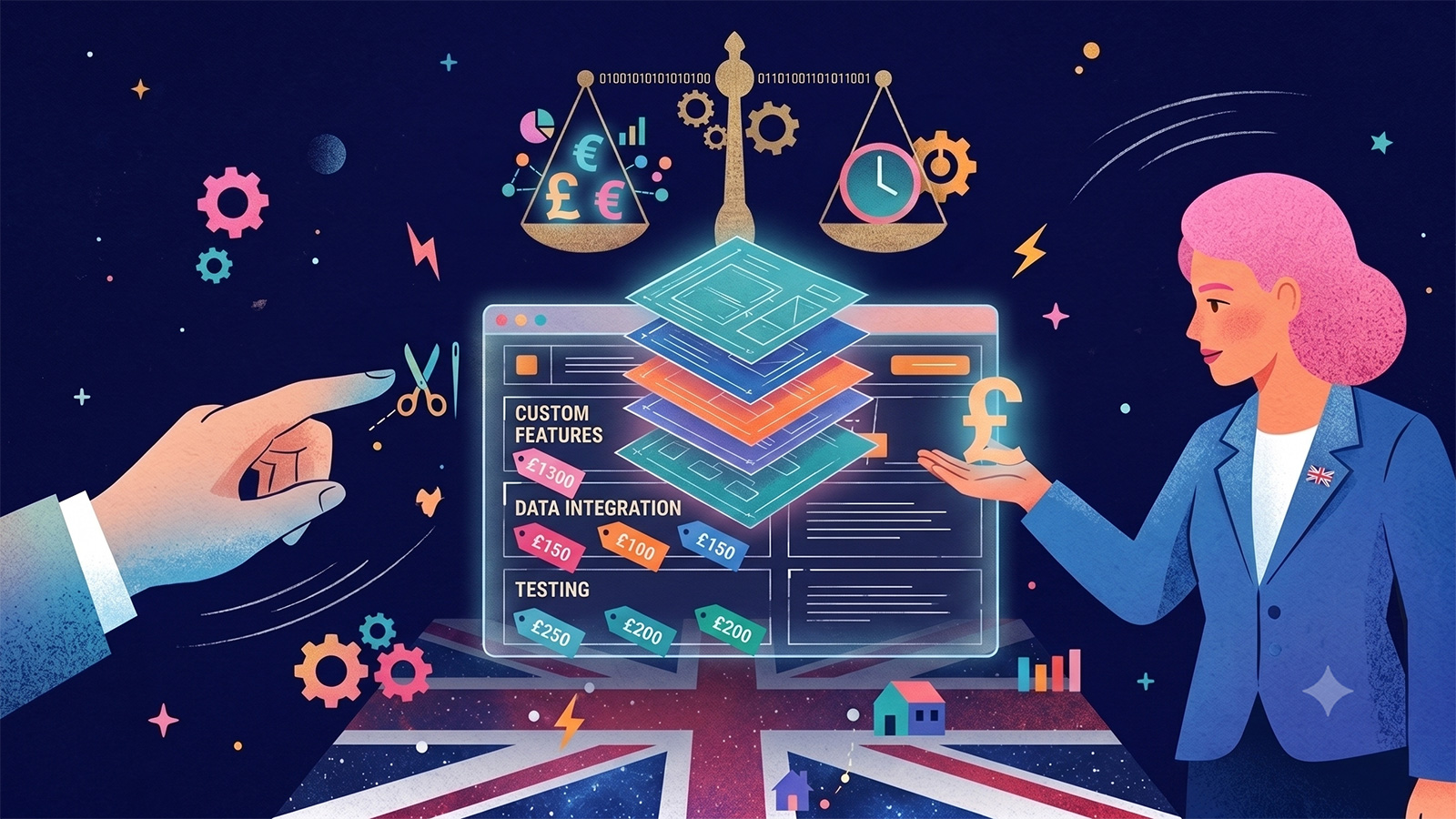
Is a lack of user research holding you back? Websites are a tool for solving problems but too many businesses changed over time and don’t take the time to stop and ask simple questions.
Answering questions about who your target audience is and why they use your service can help you to target your users and set tailored goals.
The wonderful thing about creating goals is they can be tracked for success or failure but no matter what the result you can gain useful knowledge. The important thing is to learn from your mistakes and re-evaluate the goals to make sure they are in line with current business priorities.
02. Navigation Vs. Sitemap
The hierarchy of information on a website is a balance between the sitemap and the navigation. Some of you might be asking yourself “I thought these were the same thing?”, you are both right and wrong. The sitemap is the breakdown of information that produces navigation. Navigation is how you move around the information.
To produce the best navigation experience for your users you must first break the information up into areas that can be named clearly and simply for your users to understand. Bear in mind that the average user has an attention span of 8 seconds, so simplicity is the key!
Each section should have a goal: to inform, build trust, and sell, for example. If a page doesn’t have enough information to meet the required 300-500 words for SEO purposes can it be combined with another page to make the information worth the click?
My last thought on this subject always remembers the film ‘Inception’, and try not to go three levels deep! A sub-page helps divide up the information but a sub-sub-page often confuses and loses users.

03. Originality Over Functionality
Many clients say the 4 words that fill every designer’s nightmare, “make the logo bigger”… sorry I mean “Make my website unique”. When it comes to websites it should always be usability before creativity.
Look below at the following 2 cars:

You can see how they both follow usability principles such as 4 wheels, a driving seat inside the cabin, and a round-form steering wheel. The big difference comes from the user’s perception.
The same is true of UI/UX, why challenge widely accepted principles? Instead, aim to make small tweaks and changes to core ideas, this is the real key to innovation.
Accomplish this by researching your industry and seeing who’s doing what, and who’s doing it well. Then look at related user interfaces outside of your industry to see if you can find new features, functionality or layouts that can solve problems better than the best of your industry’s offerings.
04. Is It A Button?

Other than the navigation itself all movement around your website will be done through buttons so to create a pleasurable user experience these need to be done well or face a lack of conversions.
The key to a high conversion rate is to highlight a clear path for users to accomplish your conversions. The best way to accomplish this is the proper use of “Call To Action” buttons, better known in the industry as CTA’s.
Clear CTA’s can be done in several tried and tested ways such as reserving a bold colour specifically for buttons, making it look like a button (in a box with curved corners), adding animation or making it big enough to see but not so big you want to ignore. When you’ve made a good button it will be so inviting you can’t wait to click it.
05. Poor Contrast
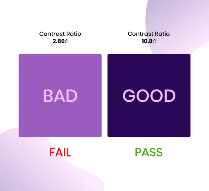
Poor contrast is not the most exciting finale but one of the most overlooked mistakes on websites. A low contrast produces lower usability despite being easy and sometimes scientifically checked, so no excuses!
- Contrast In Colour: Using Online Contrast Checker Tools You Can Simply Add Your HEX Or RGB Colour Codes To Get A WCAG AA And AAA Score.
- Contrast In Size: Creating A Hierarchy Of Information Is Important For Usability And This Can Be Done Through Using The Big Headings For More Important Information And Small Fonts Sizes For The Less Important Stuff.
- Contrast In Alignment: Alignment Is Important To Help The User Easily And Quickly Identify Related Elements.
Hopefully, this article has given you some useful information so you can make improvements to your own website.
If you are looking to begin your journey to a better user experience and would like to work with a team of experts please get in touch with us and talk to our team who will be more than happy to help. Alternatively, look around our services or even our projects to get a taste of what SourceCodeStudio can do for you.