In today’s digital age, where smartphones and tablets have become an integral part of our lives, having a website that adapts to different screen sizes is more important than ever. Responsive design has emerged as a crucial element in the world of web design, enabling businesses to create user-friendly and visually appealing websites across all devices.
In this blog post, we will explore the meaning and principles of responsive design, showcase examples of its effectiveness, and emphasize why it is a must-have for any business looking to grow online.

Understanding Responsive Design
Responsive design refers to a web development approach that allows a website to adapt and respond to the user’s behaviour and environment based on the screen size, platform, and orientation.
The core principle behind responsive design is to provide an optimal viewing experience, ensuring that users can navigate and engage with the website seamlessly, regardless of the device they are using.

Principles of Responsive Design
To achieve a responsive website, designers follow a set of principles that guide their design process. One such principle is fluid grids, where the website layout is based on proportions rather than fixed measurements. This ensures that elements on the webpage adjust proportionally as the screen size changes, maintaining a consistent and balanced appearance.
Another important principle is flexible images, where images are sized and scaled based on the device’s screen resolution. This prevents images from appearing pixelated or distorted, providing a visually pleasing experience. Additionally, media queries are used to apply specific styles and layouts based on different screen sizes, tailoring the website’s appearance to suit the device being used.
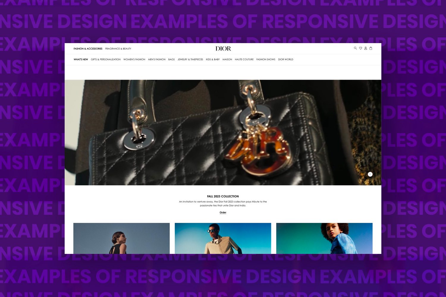
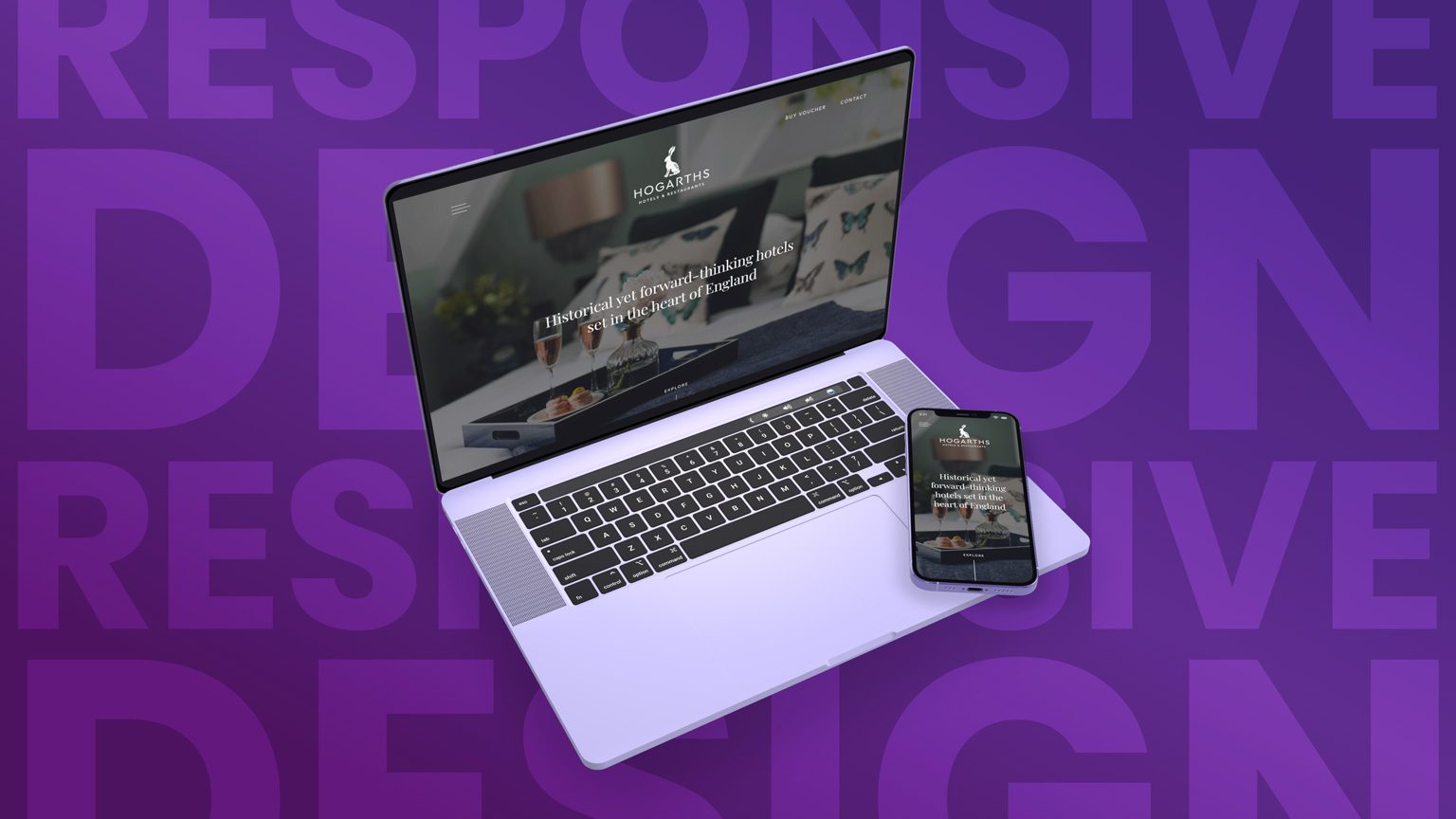
Examples of Responsive Design
Let’s delve into some real-world examples of responsive design in action. One excellent illustration is the fashion retailer Dior. On a desktop, the website showcases large, high-resolution images and detailed product descriptions. When accessed on a mobile device, the layout adjusts, presenting a simplified version with larger buttons and an easy-to-navigate menu, ensuring a seamless browsing experience.
Another noteworthy example is the BBC news website. News websites often have multiple columns of text and images on larger screens, but as the screen size reduces, the columns rearrange themselves into a single, vertically stacked layout, optimising readability and user experience.

Benefits of Responsive Design
Responsive design offers numerous benefits for businesses. Firstly, it enhances user experience, as visitors can effortlessly access and interact with the website on any device, resulting in increased engagement and reduced bounce rates.
Secondly, responsive websites improve search engine rankings, as search engines prioritise mobile-friendly websites in their algorithms. This can boost organic traffic and help businesses reach a wider audience.
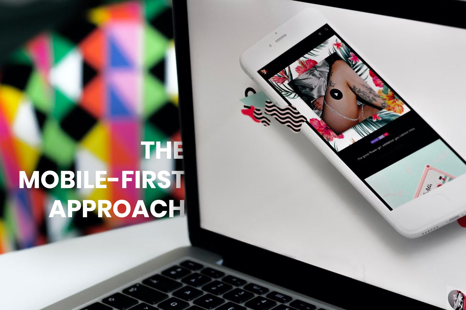
The Mobile-First Approach
With mobile usage surpassing desktop, adopting a mobile-first approach in website design has become imperative. Designers prioritise the mobile layout and functionality, ensuring that the website provides an exceptional experience for mobile users.
By starting with the smallest screen size, designers can focus on delivering key content and functionalities, making the website more efficient and user-centric.

Hiring a Responsive Design Agency
Partnering with a professional web design agency that specialises in responsive design is crucial to ensure flawless implementation. With over half of the internet being accessed by mobile devices, it has gone from an additional feature to a must-have for any web design project.
A responsive design agency has the expertise to create visually stunning and user-friendly websites that are optimised for all devices. They employ the latest tools and tried and tested techniques to deliver a responsive web design that aligns with your brand’s vision and goals.

The Future of Responsive Design
As technology continues to evolve, the demand for responsive design will only increase. With the emergence of new devices, such as smartwatches, voice assistants, and Apple Vision Pro, designers will face new challenges in adapting websites to these platforms.
However, the core principles of responsive design will remain the same – creating seamless user experiences and engaging web interactions across all devices.

Empowering Web Designers
Responsive design empowers web designers to think beyond static layouts and explore creative possibilities. It allows designers to craft websites that captivate users, promote interaction, and drive conversions.
By embracing responsive design, designers become catalysts for innovation, bridging the gap between technology and user experience.
Conclusion
In conclusion, responsive design is no longer a luxury but a necessity in today’s digital landscape. It enables businesses to deliver engaging web experiences, regardless of the device users choose to access their websites.
By adhering to the principles of responsive design and partnering with a responsive design agency, businesses can create visually appealing, user-centric websites that drive success in an increasingly mobile-driven world.
If you still aren’t sure how to get started with responsive web design, book a FREE 30-min session with us to talk about your next project.
Our team of website experts have years of experience working on creating websites that convert, and we’d love to help you too.